For iPad the basic article layouts exist (and other tablet-size 7-10 “), ie. either 768 x 1024 or 1024 x 768. These layouts also serve well for iPad with Retina resolution (generally also for other tablets that have double the pixel resolution).
In addition to basic layouts you can also establish an alternative mobile phone layout for each article.
If your reader is universal for iPad and iPhone and you will not create an alternative layout, because the user will see the same (i.e. reduced) data on the iPhone. The situation is similar in a reader device for tablets/Android phones.
However, if you create alternative layouts for phones, you may provide a better graphical processing of your issue on iPhone and Android phones.
Layout setup for phones
Click on a page number to view menu how to work with individual pages:
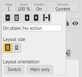
This icon indicates tablet layout (also indicates landscape or portrait layout). Clicking the phone layout icon calls up the dialog box:
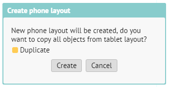
The Duplicate option may require that all objects from a tablet layout are also copied into the layout for the phone. Since the layout of the phone has basic size of 320 x 480, all objects are automatically reduced by half.
Switching between layouts
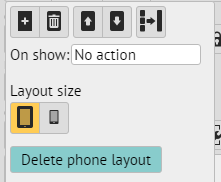
Once article exists in two layouts, you can switch between them within the same menu. If you have a tablet layout displayed (default), you can delete the phone layout:
Text styles in alternative layouts
Each text style has two forms after the establishment of alternative layout: the phone one arises from a tablet form by reducing it by half. That is usually too little, but you can increase the font again. You will then need to adjust the size of text frames so that the enlarged font fits them well.