The dialog for color setting appears whenever you set the background color of the object, its margins, font color, etc. Triobo is additionally using the opacity beside the hue, saturation and brightness. In previews opacity is indicated by transparent square grid – in reality the transparent color shows in such way that you can partially see the background beneath the color.
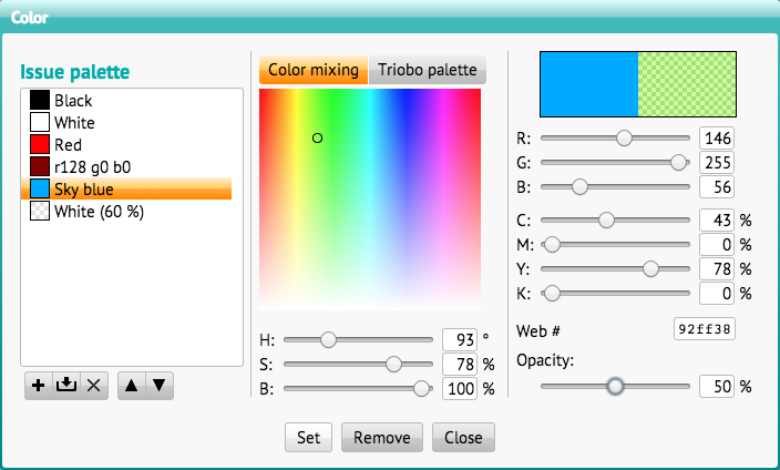
The dialog for color selection contains three sections. The middle section contains two tabs. Color mixing makes the color selection easier in the HSB color model: you just select the hue value (H = hue) as an angle from 0 to 359 °, saturation (S = saturation) and color brightness (B = brightness), both values from 0-100%. The color spectrum also corresponds to this model: clicking with mouse you select hue (horizontal) and saturation (vertical). The change of brightness (B) will also change the brightness on color spectrum for better indication.
The second tab of Triobo Palette is used for quick selection of 90 preset colors. By clicking the color you immediately select it.
The right section displays two previews at the top: on the left it shows color before changes, the right one displays currently selected color. Then the settings of RGB model are displayed, where you set the brightness in values from 0 to 255 of each light component of color (R = red, G = green, B = blue). The CMYK model is set correspondingly to four printing colors (C = Cyan, M = Magenta, Y = Yellow and K = Black).
The section Web is used for entering of values as used in HTML. You can either specify six characters (equivalent to three two-digit hexadecimal data) or only three of them which will be automatically translated to six characters by duplicating individual characters. (example 75a is overwritten to 7755aa)
The last pull bar sets color opacity. In some cases, this option can be disabled.
All pull bars can be controlled with mouse or by entering their numeric value. If the cursor is in a numeric field, you can change the values with up and down arrows. If you hold down the Alt key, the value will change by 8.
Issue palette
On the left section you find issue palette. If you have already mixed color, you can save it to the palette by pressing the plus button. If you’ve previously selected the color from the palette and edited it, you can save it by pressing Save button. In both cases, a dialog for color name appears. When name colors you can click Automatic button, and color will be renamed according to its values in the RGB color model. (next time when you change the value of automatically set name, the name will be again changed automatically according to its current color)
Up and down arrows change the order of colors, the cross is used to delete a color from the palette. Double-click the color name for immediate use.
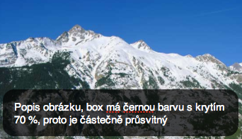
Importance of translucent colors
The advantage of translucent colors is that they can be used for effects when you need the object itself to be completely covered, but to show the picture through its background. Typically it may be the black color with 70% opacity as a text box background with otherwise white letters. While the white letters (use 255, 255, 255, 100% color) will entirely cover the background and will be contrasting, the black color will only darken the picture behind the object.