The Reader design according to publisher’s configuration
Triobo allows publishers to define customized reader appearance on tablets and smartphones. This new feature allows to attract readers and advertisers effectively.
Let me first recall that all reader devices created in any price tariff of Triobo digital publishing are published strictly under the brand and name of the client, with his icon and initial screen.
Exclusive look and new business opportunities
Section titled “Exclusive look and new business opportunities”What can be arranged by publisher who is using the Triobo Professional or higher tariff?
- Wallpaper background – static and dynamic(!). The publisher creates the entire wallpaper directly in Triobo editor, thanks to that the wallpaper can be animated, with interactive features, may even include video, as you will see at the end of this article. The background of the reader is created as any regular page of interactive digital publication. Besides that the publisher determines at what place the overview with issues of digital publications will be displayed (in transparent layer placed over a wallpaper).
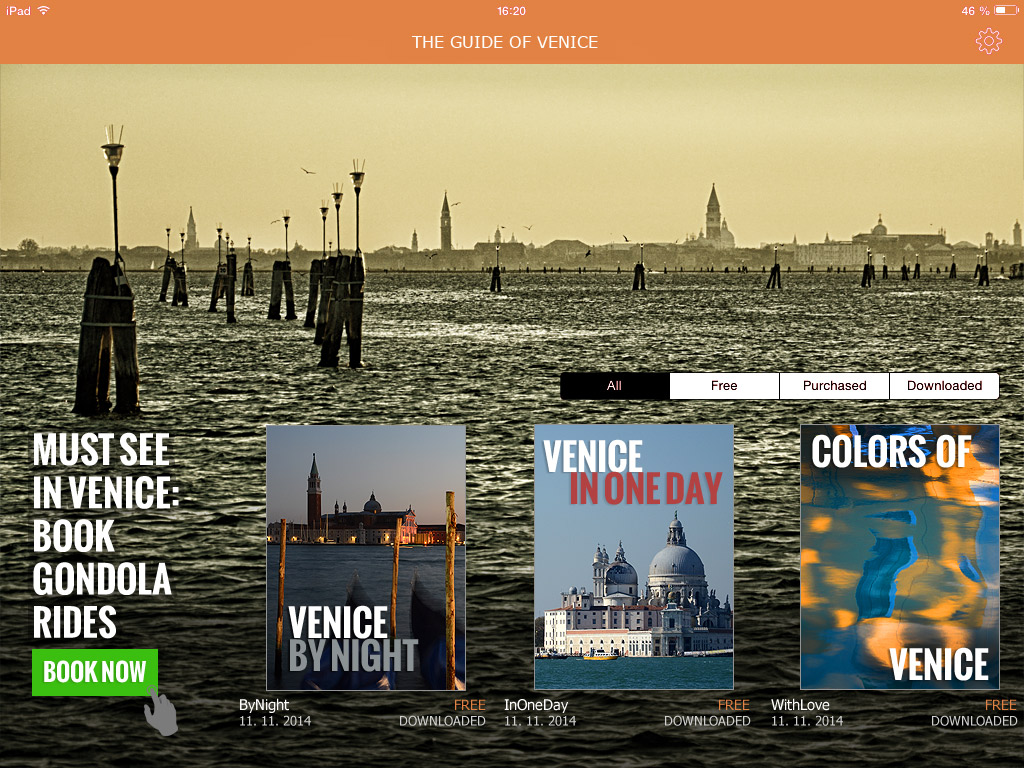
- Internal or commercial advertising. The previous paragraph implies that the reader background may include any advertisement, again with animations, interactive elements, videos and so on. In the example of Venice Guide (see below), note that the ad may include the click through button to the advertiser’s website.
- Colors used in the reader. All standard reader features, such as. the upper bar, bookmarks with issue selector, dialog with issue detail that appears when you click on the envelope – all that may be colored according to the publisher’s desire.
And that’s not all:
- The publisher may create different wallpaper versions for tablet landscape orientation and another one for portrait version (different layout and graphic content may be created).
- You may have reader with separate wallpapers for tablets and mobiles.
- The publisher may display a different reader wallpaper for Apple iOS platform layout and another one for Android platform.
- The reader design can be remotely updated.
How this can look like?
Section titled “How this can look like?”At the Venice Guide example you see the reader with own wallpaper (photo), where a commercial advertising was placed (order for gondola ride). The overview of issues – in our example three separate Guide issues – was positioned so that it aesthetically complements the picture. The entire reader was additionally colored in harmony with photos.

