You can study how to set colours and preview modes for an application in separate article. In this article we´ll cover the designing of issues overview. See image below for an example.
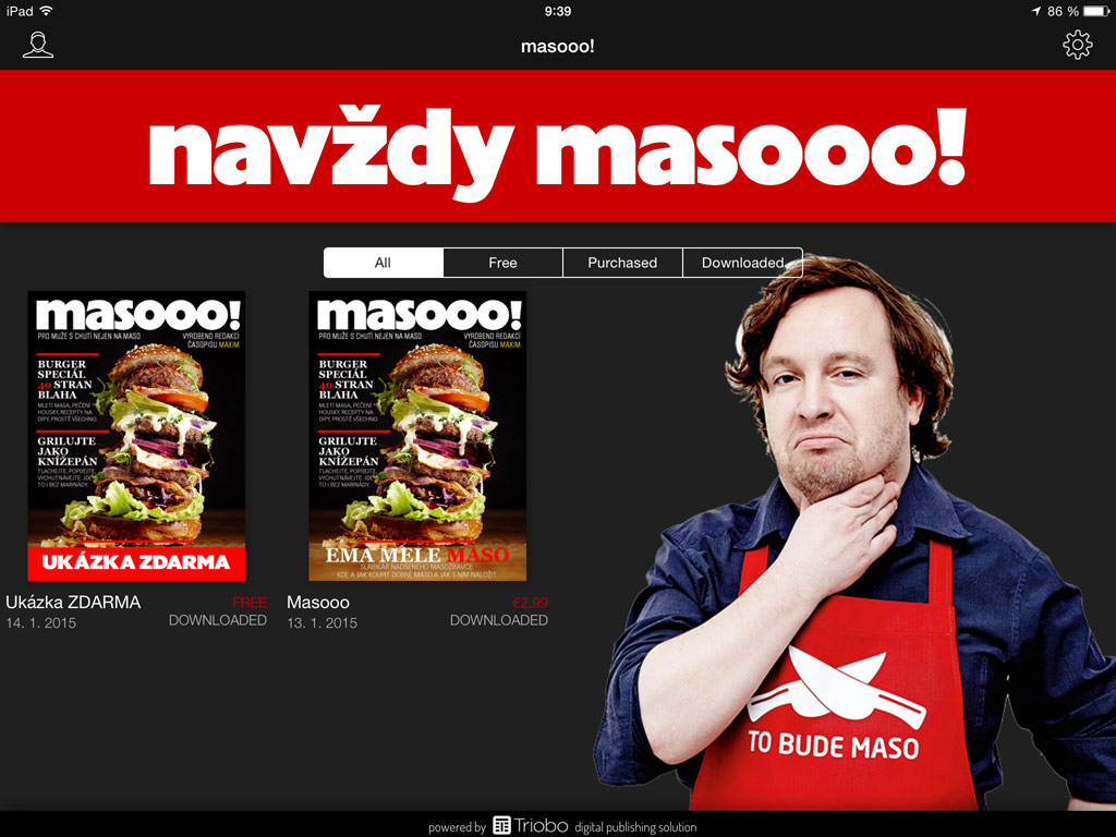
Everyone with the Triobo Professional subscription can customize their design. Those with the subscription see in the issues list of the publication a specially named issue with a single article.

Everyone with the Triobo Professional subscription can customize their design. Those with the subscription see in the issues list of the publication a specially named issue with a single article.
Tip: if no object is selected, use W key to see borders of all objects on the page.
The page contains (void) object named __coversP. This object is important, as it renders each individual issues. You shouldn’t delete this object (exception is described below). To see the object, you can use W key. We recommend to place it in the front layer.
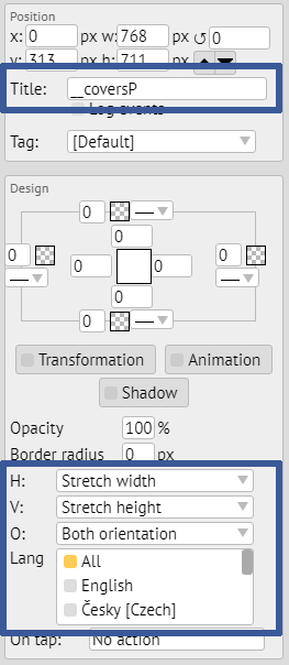
On the screenshot, notice the second blue order at the bottom. It shows the distinction of the editor for design customization. Because the issues overview may be displayed on devices of various dimensions (web, Android and Apple tablets, Windows 10 app etc.), the typesetting in not expressed in absolute coordinates, but everything is aligned to the screen corners or to the middle.
For each object (or group of objects) you can set:
- Horizontally: align left (default), align to middle, align right or stretch width according to position of right and left edge of the object.
- Vertically: align to top, align to middle, align to bottom or stretch height according to top and bottom edge of the object.
- Object: Set if object should be always visible, or only in landscape or portrait tablet orientation. With this, you can easily create designs for specific display orientations.
- Language: if you design for multilanguage reader application, you can set target language destination for selected object.
TIP: for better arranged work use tags, to show or hide specific objects as needed.
How to replace the cover pages with custom graphics?
In most cases, you’ll want to have visible covers of your issues (typically magazines). Sometimes, however, you want to replace this presentation with your own graphics, such as active icons:
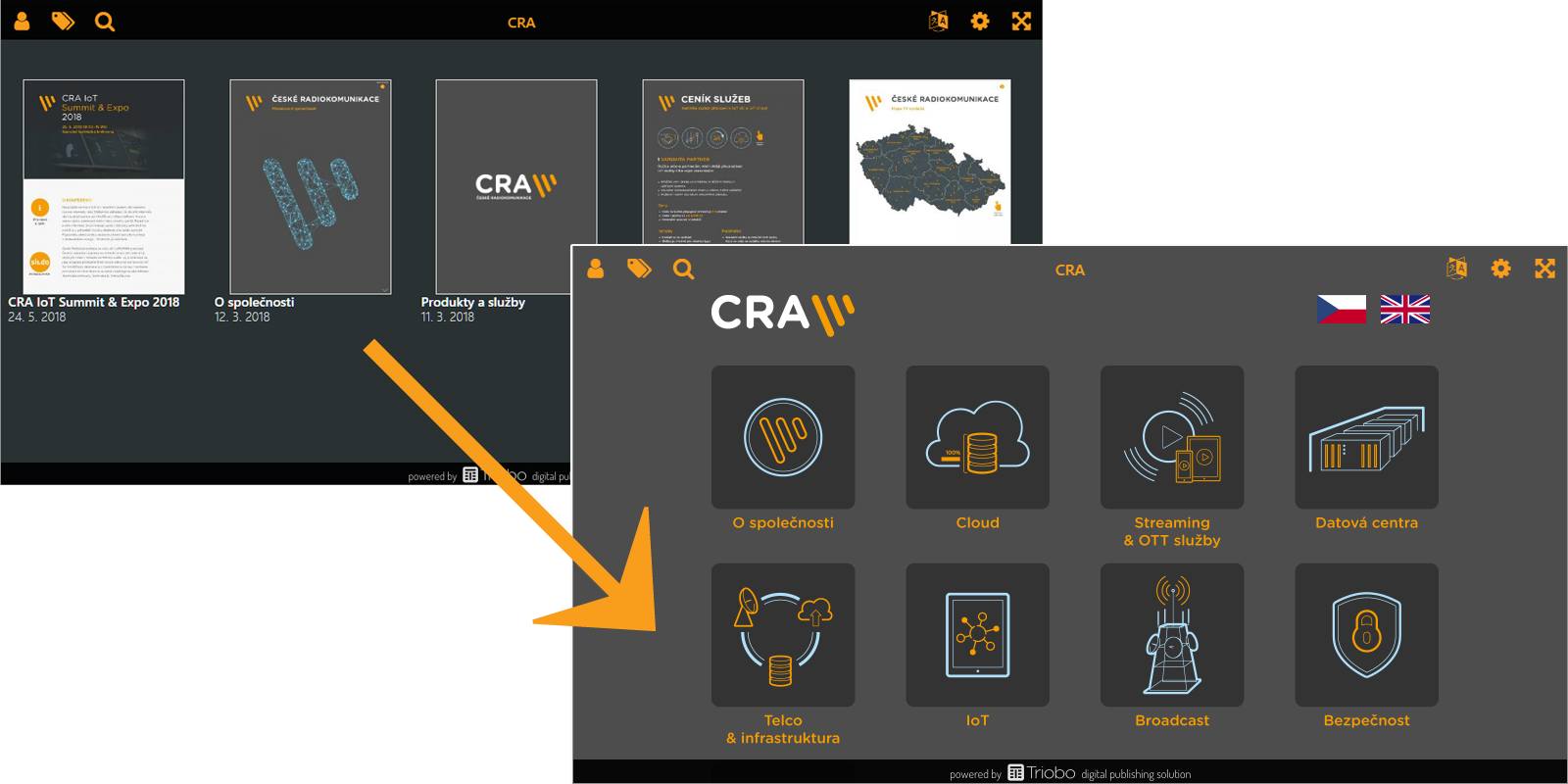
In this situation, you can delete __coversP object (read above), which renders the cover pages. Or, even better, don’t delete the object and only move it out of the visible area, for example, above the page. Create icons on the page, clickable maps etc. (as you wish), and use On Tap feature of Triobo, Open issue option.
More complex construction
And what if you want to add for example a frame filled with some colour, containing text on the left side aligned to the left, image on the right aligned to the right, and was stretched according to actual width of the screen? That´s simple. First draw the (text) frame, fill it with colour and place the object above it. Frame will be set to spread horizontally. Left object will be aligned to the left same as the right object to the right.
How can you make life easier?
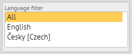
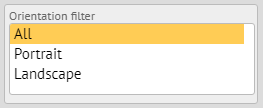
To make your design work better, you can use automatically prepared filters to switch the editor to a specific language and / or orientation. The filters appear in the left column when you have no object selected.
How to test the design
You can publish in Triobo Content Reader as usual. To speed up the design change after publishing, close the Triobo Reader and start it again.